-
Interior Designers: CUN Design
- Area: 430 m²
- Year: 2017
-
Photographs:Wang Ting - Wang Jin

A. Feel SERIP
When I first saw the Portuguese brand SERIP lamps, their round, spiral and irregular shapes rooted from the nature remind me of the fantasy world in the movie Alice's Adventures in Wonderland. Getting rid of traditional rules, the lamp design perfectly integrates styles such as minimalism, modern and classical. I love SERIP, it gives me a kind of fantastic, romantic and stunning colorful feeling. It is a big surprise for me that I had the chance to design its Beijing exhibition hall in March 2017.

B. Space Temperament
In my opinion, a good design should be a customized one rather than a copy. Each space has its own temperament, the designer must enter the space to feel it, and then design accordingly. Exhibition hall design is a sort of display design, which combines the best space relation between people, exhibits and space. When I was commissioned by SERIP to do the design, all I wanted to do is creating a very different form of exhibition hall. This "difference" should have its own temperament, so we went to the space to feel it.


C. Encounter a beam of light
When we came to the project location in Maquanying Beijing, it was around 3 pm in April. The house stands in a spacious plant area. It is in color steel tile structure with low cost and rough construction, and integrates with surrounding buildings as a whole. All in all, it lacks conditions of being an independent brand store. Although this first impression disappoints us, when we walked into this space, a beam of light shone into the space through the only skylight, it was like a very clean line drawn in the air dividing the space into two parts. At that moment I found the temperament of this space! It is this beam of sunshine that divides the space. Likewise, lamp can bring different display effects in daytime and at night. So we use this beam of light cutting the space into black and white spaces, where the two extreme colors are both contradictory and united. After some combination, the borders of the two colors align with the border of that beam of light, thus a perfect state was achieved which enables SERIP lamps show their lighting effect and charm both in daytime and at night.

D. Methodology
Black and White
In the black area and white area, we created some artificial light according to SERIP products. In the black area, a number of crystal lamps were displayed to show the value and light of lamp to the most extent; while in the white area, lamps with good-looking shapes were displayed and these unique handblown glass lamps is shown perfectly.

Building with Hidden "Door"
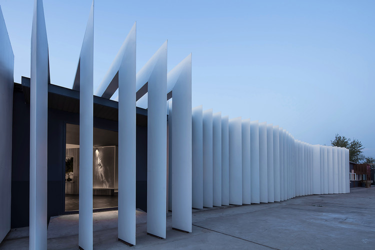
As to the facade, we used the form of slices in the facade to hide the whole building, instead of strengthening the building itself. The white slices formed the main point of view of the hall. Under sun light, the shadows of slices change with time. What's more, as no obvious entrance is design, so the independence of the whole exhibition hall is formed.

Transition Wall
We have added some gray walls in the space, which helps to form separate independent areas in black and white spaces. These areas are used to show the lamps, acting as the background of the display.

Let dream shine into reality
SERIP lamps are so beautiful and romantic that they should appeared in fairy tale world. Thus, we found animal images with matching temperament and put them inside the gray wall to create a fantastic field.

E. Value
When the SERIP fixture is finished, the space looks very unique. In my opinion, a good commercial design is to cater for business, not for the eyes, nor the expression desire of designer. So I think, only when lamps and lanterns in this space are bought by customers, the space design was proved to be a good one.

F. Conclusion
Good design creates a good space, good space creates good value. Let's meet next year in March, when the beam of light returns to this space and once again divides the space into two parts, we will hold a party in this fantastic forest.


